Shopper
Discover the brand. Explore products. Shop.
Customers needed a clear way to understand Prism, browse the cotton candy collection, learn about flavors, find where to buy, and purchase online.

Case study
A colorful ecommerce website designed to bring product storytelling, online shopping, wholesale information, retailer support, and brand personality into one cohesive experience.
The site needed to work for two different audiences — customers shopping for candy and retail partners learning how to carry Prism products — while still feeling like one consistent brand.
Website Design · Ecommerce · Wholesale Content · Retailer Experience · Responsive Design
Prism Candy Co. is a business we own and operate, giving us the opportunity to build around real ecommerce, wholesale, retailer, and customer-support needs.
Designed to stay clear, colorful, and easy to navigate across desktop, tablet, and mobile.


The business need
Some visitors come to Prism Candy Co. to discover the brand, explore products, and shop. Others arrive as retailers looking for wholesale information, product details, and a clear path to working with Prism.
The challenge was to support both audiences without making the website feel like two separate businesses or forcing either group to dig for what they needed.
The experience needed to stay colorful and consumer-friendly while still giving retail partners the practical information they expect.
Discover the brand. Explore products. Shop.
Customers needed a clear way to understand Prism, browse the cotton candy collection, learn about flavors, find where to buy, and purchase online.
Understand the products. Explore wholesale. Get in touch.
Retailers needed practical information about Prism products, wholesale opportunities, availability, and how to start a conversation about carrying the brand.
Navigation, content, ecommerce, and wholesale information were organized so each audience could move toward the right next step without losing the personality of the brand.
What we built
We organized the website so shoppers could move naturally from discovering Prism to exploring products and purchasing online, while retail partners could quickly find wholesale information and a clear way to connect.
Brand storytelling, ecommerce, retailer information, and support content all needed to feel connected rather than competing for attention.
Product discovery, flavor information, ecommerce, and purchase decisions.
Retailer-focused information about carrying Prism products and starting a wholesale conversation.
Explain who Prism is, what makes the products distinctive, and create a recognizable consumer experience.
Help stores and partners find product information, availability details, and useful next steps.
Help customers find places carrying Prism products.
Give shoppers and retailers a clear way to ask questions.
Keep the experience easy to use across desktop, tablet, and mobile.
Help different audiences reach the right content without unnecessary searching.
The structure gives shoppers and retail partners different paths while keeping the visual identity, navigation, and overall Prism experience consistent.
Inside the experience
Prism’s website needed to feel playful and easy for shoppers while still giving retailers the practical information they need. Each part of the site serves a different job without losing the personality of the brand.
01 / Experience
Product discovery without losing the personality of the brand.
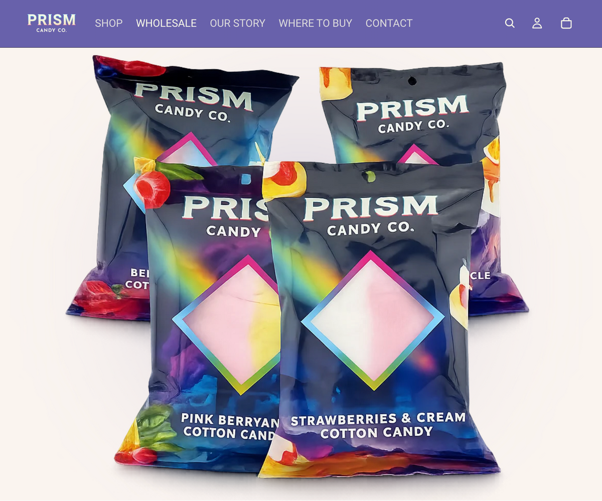
The shopping experience gives customers a clear way to explore Prism’s cotton candy flavors, understand the products, and purchase online while keeping the colorful brand front and center.
Ecommerce · Product discovery · Brand storytelling
02 / Experience
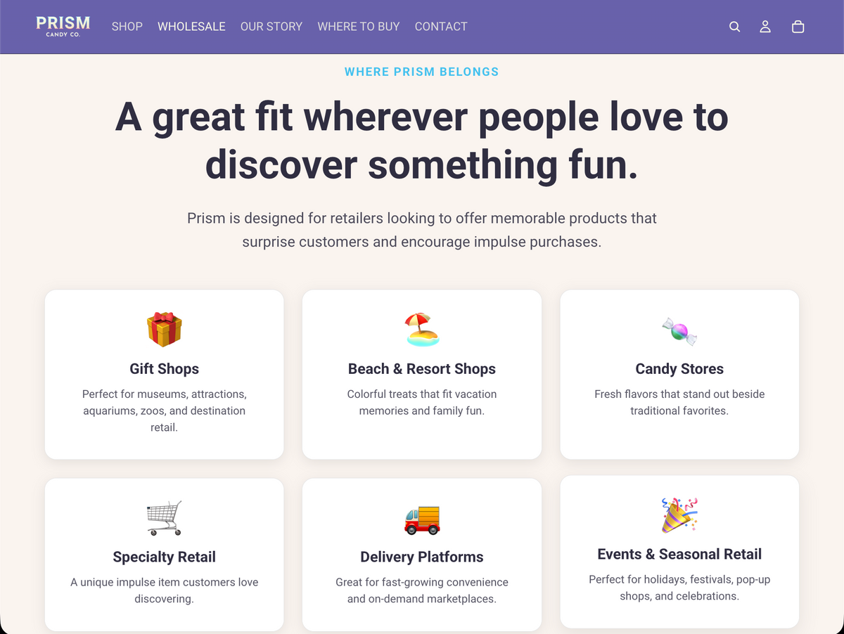
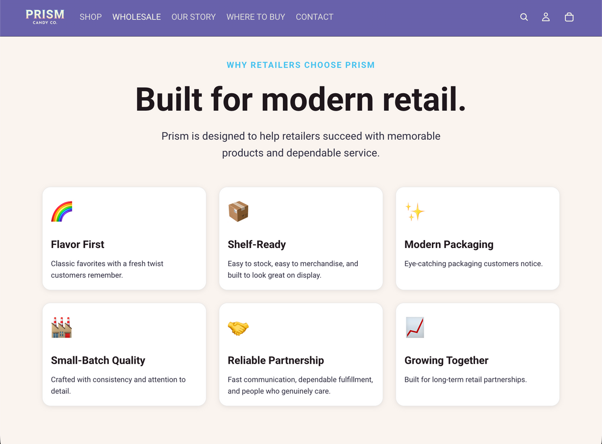
A practical path for retailers interested in carrying Prism.
The wholesale experience gives retail partners a dedicated place to understand the brand, product offering, wholesale opportunity, and how to begin a conversation with Prism.
Retailer information · Wholesale content · Lead generation
03 / Experience
Useful information without breaking the brand experience.
Our Story, Where to Buy, Contact, and retailer-focused content help customers and stores find useful information while keeping the overall Prism experience consistent.
Brand story · Where to Buy · Contact + support
The same shopper and retailer experiences were designed to remain clear across desktop, tablet, and mobile.
Design direction
Prism Candy Co. needed a website that could carry the personality of the brand without letting color and product imagery overwhelm the customer experience.
The visual direction combines playful color, clean layouts, strong product imagery, generous spacing, and straightforward navigation so the site can feel fun for shoppers while still presenting wholesale and retailer information professionally.
Playful brand. Practical website.


Bright brand colors bring personality without taking over every surface.
Light backgrounds and generous spacing give colorful products room to stand out.
Packaging and product photography provide much of the visual energy.
Bold headings, simple navigation, and readable content keep the experience easy to follow.
The same visual system carries across desktop and mobile so Prism remains recognizable without sacrificing readability or navigation.
Functionality + ecommerce
Prism Candy Co. needed more than a colorful storefront. The website also had to support online shopping, wholesale interest, retailer information, customer questions, and everyday brand content in one manageable place.
The goal was to give each audience the tools and information they needed without making the website feel complicated or overly transactional.
Useful functionality should feel like part of the experience — not something bolted onto it.
Product pages, online purchasing, payments, and store management within Shopify.
Clear product and flavor information helps shoppers understand what Prism offers before purchasing.
Dedicated retailer content gives stores a clear place to learn about Prism and wholesale opportunities.
Contact points help shoppers and retail partners ask questions and move toward the right next step.
Retail-location information helps customers find Prism products beyond the online store.
Shopping, wholesale information, and support content remain usable across desktop, tablet, and mobile.
The website brings ecommerce, brand content, wholesale information, and customer support together while keeping each path easy to understand.
The finished result
The finished Prism Candy Co. website brings ecommerce, brand storytelling, wholesale information, retailer support, and customer resources together in one clear online experience.
Shoppers can discover the brand, explore products, find where to buy, and purchase online, while retail partners have a dedicated path to learn about Prism and understand how to start a wholesale conversation.
The experience was designed to remain colorful, clear, and easy to use across desktop, tablet, and mobile.
